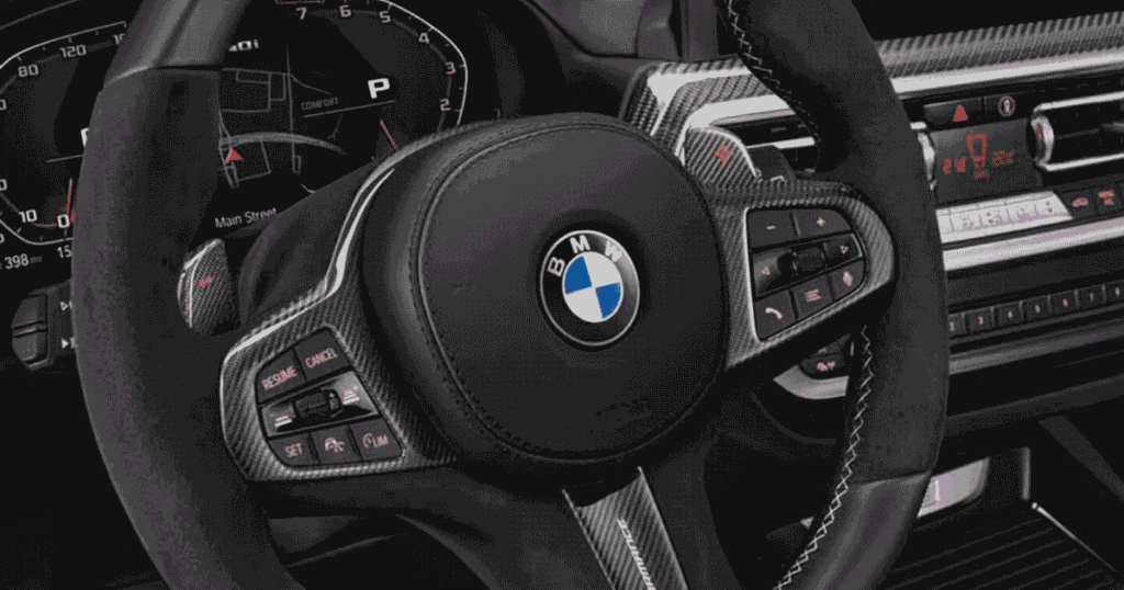

Have you ever looked at the BMW logo and wondered what it really means? The BMW Symbol is easy to recognize, yet many people are unsure about its colors, shape, and history. If you have searched for the meaning behind this famous badge, you are not alone. Its simple design has a deeper story that makes it even more interesting to understand.
In this guide, you’ll learn everything important about the BMW Symbol in simple terms. We’ll explain its meaning, colors, design, history, and common ideas about its origin. You’ll also understand what the logo represents and why BMW continues to use this recognizable symbol. By the end, you’ll have a clear and helpful overview of the famous BMW badge.
What the BMW Symbol Represents
The BMW Symbol represents the company’s identity, heritage, and strong connection to Bavaria. Its blue and white sections are linked to the colors of the Bavarian flag. The circular shape creates a balanced and memorable design. These simple elements work together to form a recognizable badge that appears on BMW vehicles around the world today.
The symbol also reflects BMW’s long history as a German automotive brand. Many people associate it with German engineering, quality, performance, and luxury. Some believe the design represents an airplane propeller, but that is a popular myth. Its meaning is more closely connected to BMW’s Bavarian roots, history, and distinctive brand identity.
Historical Background of the BMW Logo
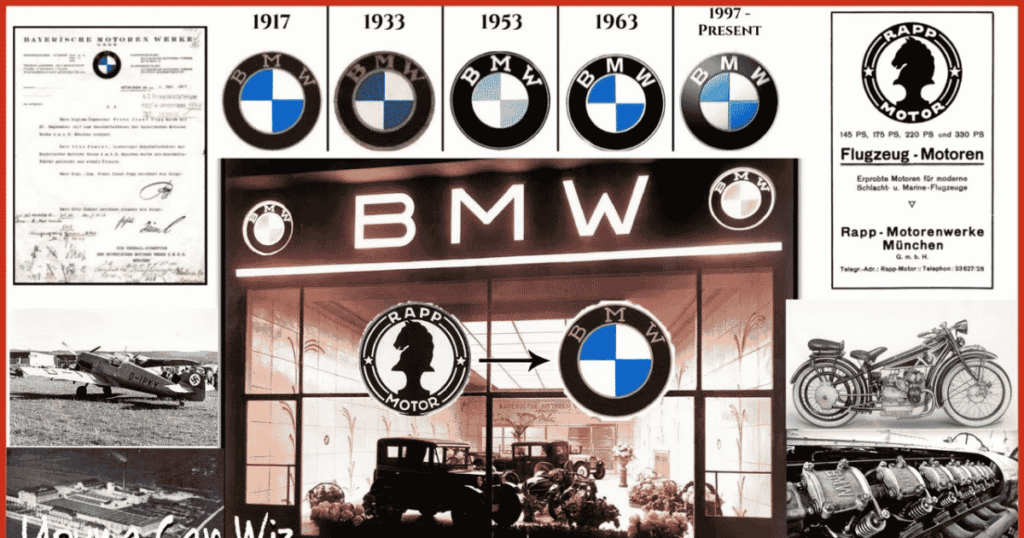
The BMW logo has changed over time, but its core identity has remained remarkably familiar. From its early beginnings to its modern digital form, each update reflects a different stage of the company’s growth. The history behind the emblem also clears up some common misunderstandings about its colors, design, and famous propeller connection.
Early Development (1917)
The BMW logo first appeared in 1917, when Bayerische Motoren Werke became an independent company. Its early emblem used a circular design, BMW lettering, and blue and white sections. The colors connected the brand with Bavaria, while the ring gave the mark a strong, formal appearance. This original design established the visual foundation that BMW still recognizes and uses today.
Mid-20th Century Adjustments
Over the following decades, BMW adjusted its logo without abandoning its familiar structure. Changes mainly affected lettering, proportions, and presentation as the company grew. The emblem appeared on cars, motorcycles, and corporate materials, helping strengthen brand recognition. Interestingly, the propeller interpretation became popular through advertising, rather than serving as the logo’s original official meaning from the beginning of its history.
Modern Refinement (2020 Update)
In 2020, BMW introduced a flatter, more modern logo for digital communication. The redesign removed the traditional black outer ring and created a transparent appearance around the central blue and white sections. BMW kept the core colors and circular form, showing how a brand can modernize its visual identity without throwing away the features people already recognize and trust worldwide.
A Design That Kept Its Roots
BMW’s logo history shows that successful branding doesn’t always require dramatic changes. The company refined small details while protecting its recognizable shape, colors, and initials. Think of it like updating a classic suit with a modern cut. The appearance changes, but the personality stays intact. That balance helped the emblem remain familiar across generations and markets.
From Heritage to Digital Branding
The latest design reflects how people now encounter brands on phones, websites, and social media. A simpler logo works better at different screen sizes and digital formats. BMW’s evolution therefore isn’t only about appearance. It also shows how an established German automotive brand can respect its heritage while adapting its visual identity for modern communication.
Read More : Blueflamepublishing Blog: Complete Guide to Content, Features & Online Value
Design Elements Explained
The BMW logo uses simple shapes, colors, and lettering to create a strong visual identity. Each element has a purpose and helps make the emblem instantly recognizable worldwide.
| Design Element | Explanation |
| Circular Shape | The round design gives the emblem a balanced and classic appearance that works well on different BMW vehicles. |
| Blue and White | These colors connect the logo with Bavaria and form one of BMW’s most recognizable visual features. |
| Four Quadrants | The center contains four alternating blue and white sections arranged in a simple, balanced pattern. |
| Black Outer Ring | Traditional versions used a black ring around the center, creating a clear boundary and strong contrast. |
| BMW Lettering | The BMW initials sit around the upper part of the emblem and make the brand name easy to identify. |
| BMW Initials | BMW stands for Bayerische Motoren Werke, the German name of the company. |
| Symmetrical Layout | The balanced arrangement gives the logo a neat appearance and makes it easy to recognize from a distance. |
| Strong Contrast | The combination of dark lettering with blue and white sections helps the emblem remain visually clear. |
| Roundel Style | BMW’s circular emblem is often called a roundel, a design style commonly associated with vehicle badges. |
| Modern Flat Design | The 2020 redesign simplified the emblem for digital use while keeping its familiar circular form and core colors. |
Why the BMW Logo Stands Out
The BMW logo stands out because its design is simple, balanced, and easy to recognize. The blue and white sections create strong visual contrast while the circular shape gives it a classic look. Its clean layout also works well on cars, signs, advertisements, and digital screens without losing its familiar appearance or strong brand identity.
Several details help the emblem stay memorable across different markets and generations. The clear lettering makes the brand easy to identify at a glance. Its balanced colors and shapes create a polished appearance. BMW also keeps its core design consistent while making small updates for modern branding needs. This helps the logo feel both traditional and current.
- Simple circular design
- Blue and white color combination
- Clear BMW lettering
- Balanced four-section layout
- Strong visual contrast
- Easy recognition from a distance
- Consistent brand identity
- Works well on vehicles and digital platforms
Evolution Without Losing Identity
The BMW logo has changed over time while keeping its core identity familiar. Its logo evolution shows how BMW modernized its visual identity without losing strong brand recognition.
The company refined details as design trends and technology changed. Earlier versions had a more traditional appearance while newer designs use a cleaner and flatter style. The 2020 BMW logo redesign especially suited websites, apps, and digital branding.
The interpretation may vary depending on the situation:
- Consistent identity: The circular form and BMW initials remain important parts of the emblem’s identity.
- Modern presentation: The flatter BMW logo works better across digital platforms and smaller screens.
- Brand recognition: Familiar elements help people identify BMW even when the logo appears in a simplified format.
- Positive view: Small design changes can make an established automotive logo feel fresh and current.
- Different opinions: Some people prefer the classic badge because it feels more traditional and connected to BMW’s history.
Common Myths About the BMW Symbol
The BMW Symbol has inspired many stories over the years, especially about its colors and supposed propeller design. Some popular claims are based on myths rather than BMW’s actual history.
- Propeller myth: Many people believe the BMW logo directly represents an airplane propeller. This idea became popular through advertising and later public interpretation.
- Aircraft connection: BMW did produce aircraft engines in its early history. However, this doesn’t mean the logo was originally designed as a propeller.
- Blue and white meaning: The colors are strongly connected with Bavaria and its traditional colors. They aren’t simply chosen to represent the sky.
- Four sections: The four blue and white sections are often said to show a spinning propeller. Their design is part of the circular emblem.
- Logo as a spinning propeller: The emblem may look like rotating blades when viewed quickly. This visual impression helped strengthen the popular propeller story.
- BMW lettering: The letters BMW do not stand for an aircraft-related phrase. They represent Bayerische Motoren Werke, the company’s German name.
- No major redesign: Some people think BMW has always used exactly the same logo. In reality, its lettering, colors, and presentation have changed over time.
BMW Symbol and Brand Identity
The BMW Symbol is a key part of the company’s brand identity. Its circular shape, blue and white colors, and clear lettering create a strong visual connection with BMW. The emblem helps people recognize the German automotive brand quickly. It also supports the company’s image of quality, performance, engineering, and luxury across different markets and generations.
BMW uses its logo on vehicles, advertising, websites, dealerships, and other brand materials. Keeping familiar elements helps maintain consistent branding worldwide. At the same time, modern updates allow the BMW emblem to fit digital platforms. This balance between tradition and change helps BMW protect its identity while staying relevant to modern audiences and customers.
Visual Presence Across Vehicles
The BMW logo has a strong visual presence across different vehicles. It appears on cars and motorcycles where its familiar shape helps create a clear and consistent brand identity.
The emblem is usually placed where it can be seen easily. Its circular design works well on different vehicle shapes and sizes. This consistency helps drivers and viewers recognize BMW vehicles quickly while connecting each model with the wider BMW brand.
- Front placement: The emblem is commonly displayed on the front of BMW vehicles for quick recognition.
- Rear placement: Many models also carry the badge at the back to strengthen brand visibility.
- Wheel details: BMW logos can appear on wheel centers and add a refined finishing touch.
- Motorcycles: BMW motorcycles use the emblem to connect their designs with the wider BMW identity.
- Consistent branding: The familiar badge helps different BMW models maintain a unified visual appearance.
Comparison with Other Car Logos
Car logos use different shapes, colors, and symbols to build brand recognition. The BMW logo stands out through its circular design, blue and white colors, simple lettering, and strong connection to Bavarian heritage.
| Car Logo Feature | BMW Logo | Common Difference |
| Shape | Circular emblem | Other brands often use shields, ovals, or custom shapes |
| Colors | Blue and white | Many car logos use silver, black, red, or gold |
| Main Symbol | Four blue and white sections | Other brands may use animals, letters, wings, or abstract marks |
| Lettering | BMW initials | Some logos use full names or unique symbols |
| Heritage | Connected to Bavaria | Other brands may highlight national, cultural, or company history |
| Design Style | Balanced and symmetrical | Some modern logos use more abstract or uneven designs |
| Brand Image | Luxury and performance | Other logos may focus on economy, speed, strength, or reliability |
| Emblem Use | Commonly placed on vehicle fronts and rears | Placement varies across different car brands |
| Recognition | Easily identified by its roundel | Recognition depends on each brand’s visual identity |
| Digital Adaptation | Modern flat versions support digital branding | Other brands also simplify logos for screens and online platforms |
Typography and Color Precision
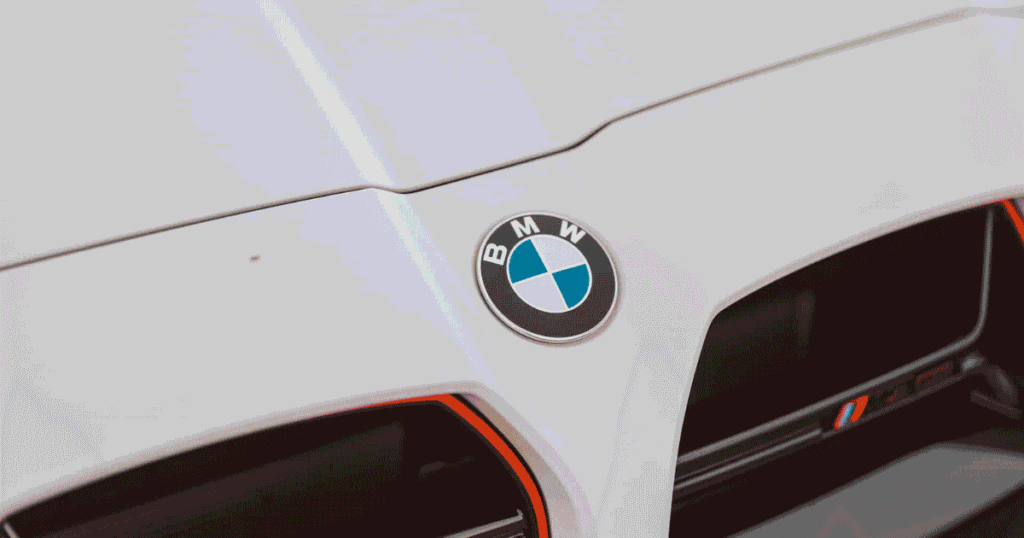
Typography and color help the BMW logo maintain a clean and recognizable appearance. The lettering, spacing, blue, white, and black elements work together to support its strong visual identity.
| Design Element | Explanation |
| BMW Lettering | Clear uppercase letters make the brand name easy to recognize. |
| Letter Spacing | Balanced spacing keeps the lettering neat and readable. |
| Bold Appearance | Strong lettering helps the emblem remain visible from a distance. |
| Blue Color | Blue connects the logo with Bavarian heritage and remains a key brand color. |
| White Color | White creates contrast and gives the central sections a clean appearance. |
| Black Ring | Traditional versions use a black outer ring to frame the central design. |
| Color Contrast | Blue, white, and black create a clear visual balance. |
| Circular Layout | The lettering follows the round shape and supports the emblem’s symmetry. |
| Modern Precision | Digital versions use cleaner shapes and simpler visual details. |
| Brand Consistency | Careful typography and color use help maintain BMW’s recognizable identity across platforms. |
Digital Era Adaptation
BMW adapted its logo for modern digital platforms without losing its familiar identity. The cleaner design works well on websites, apps, screens, social media, and digital marketing.
- The 2020 logo uses a flat logo design that looks clean on digital screens.
- The transparent background helps the emblem fit different colors and layouts.
- BMW can use the design across websites, mobile apps, and social media.
- The simplified appearance supports modern digital branding and visual communication.
- The logo remains recognizable even when displayed at smaller sizes.
- Digital applications can place the emblem over different backgrounds without the old black ring.
- This approach helps BMW maintain strong brand recognition across modern digital platforms.
Cultural and Global Recognition
The BMW logo is recognized across the world. Its blue and white colors connect the brand with Bavarian heritage and German roots. The circular design gives it a strong visual identity. Over time, the emblem has become closely linked with quality, engineering, performance, and luxury. Its simple appearance also makes the brand easy to identify.
Across many countries, the BMW emblem represents more than a car company. People often associate it with premium vehicles, driving performance, and modern automotive design. Its familiar shape appears on cars, advertisements, dealerships, websites, and social media. This consistent use helps BMW maintain strong global recognition while preserving its cultural connection to Bavaria and Germany.
Read More : Depression Symbol: Meaning, Semicolon, Black Dog, Colors & Tattoos
Interesting Details About the BMW Symbol
The BMW Symbol has several interesting details that shaped its public image. Some relate to BMW history while others explain common ideas about the logo and its meaning.
BMW has used its emblem across many generations of vehicles. This consistent use helped the badge become one of the most recognizable automotive symbols worldwide.
The interpretation may vary depending on the situation:
- The propeller idea: Many people believe the BMW logo represents an aircraft propeller. This popular idea grew from early BMW marketing, although the logo’s design has deeper links to Bavaria.
- Bavarian connection: The blue and white sections are widely associated with Bavaria. Their arrangement connects the emblem with BMW’s regional roots.
- BMW lettering: The letters around the circle clearly identify the brand. They also help distinguish the BMW badge from other circular car logos.
- Changing appearance: BMW has introduced different logo styles over time. These changes include traditional, monochrome, and modern digital versions.
- Strong recognition: Even with design updates, the familiar circular form remains easy to recognize. This consistency supports BMW’s global brand identity.
Role in Marketing and Branding
BMW uses its logo as a key part of its marketing strategy. The familiar emblem helps customers recognize the brand quickly. Its colors, lettering, and circular shape create a consistent visual identity. This design connects BMW with luxury, performance, quality, and German engineering across different markets and customer groups worldwide.
The emblem appears on vehicles, advertisements, websites, social media, dealerships, and promotional materials. Consistent use strengthens brand recognition and builds customer familiarity. BMW can also adapt the logo for modern digital platforms while keeping its core identity. This balance helps the brand stay recognizable as its marketing style changes with technology and consumer habits.
Modern Interpretation and Future Outlook
Today, the BMW logo represents a blend of heritage, luxury, and modern design. Its clean appearance works well across vehicles and digital platforms. The updated style keeps the familiar identity while giving the brand a more contemporary look for changing customer expectations and communication needs in global automotive markets.
Looking ahead, BMW may continue refining its visual identity for digital experiences. New technologies could influence how the emblem appears in virtual spaces, apps, and interactive media. However, its connection to Bavarian heritage will likely remain important. This balance can help BMW protect its recognition while adapting to future branding trends worldwide.
Frequently Asked Questions
What does the BMW symbol mean?
The BMW Symbol represents Bavarian heritage through its blue and white colors. It also reflects BMW’s history and strong brand identity.
Why is BMW called BMV?
BMW is sometimes mistakenly called BMV. The BMW Symbol uses the correct initials from Bayerische Motoren Werke, the company’s German name.
Does BMW have two logos?
BMW has different logo versions from various periods. The BMW Symbol keeps its familiar circular design across vehicles, advertising, and digital platforms.
What is the logo of BMW?
The BMW logo features BMW lettering around blue and white sections. This BMW Symbol is one of the most recognizable automotive emblems.
What is BMW full form?
BMW stands for Bayerische Motoren Werke, meaning Bavarian Motor Works in English. The BMW Symbol reflects the company’s German and Bavarian heritage.
Is BMW a luxury car?
Yes, BMW is widely considered a luxury car brand. The BMW Symbol represents premium vehicles, performance, engineering, and global brand recognition.
What is BMW’s new logo?
BMW introduced a flatter and transparent logo in 2020. The modern BMW Symbol was mainly created for digital communication and branding.
Which car is called poor man’s BMW?
The term poor man’s BMW often describes affordable cars with sporty handling. The BMW Symbol itself represents BMW’s established luxury and performance image.
Is BMW Chinese or German?
BMW is a German automotive company based in Munich. The BMW Symbol reflects Bavarian heritage while BMW operates production facilities worldwide.
Who owns 50% of BMW?
No single owner holds 50% of BMW. The Quandt family owns a major stake while remaining shares belong to public investors.
Are BMWs a status symbol?
BMWs are often seen as status symbols because of their luxury image, performance, and recognition. The BMW Symbol reinforces this premium perception.
Who is BMW owned by?
BMW AG is publicly traded and has major shareholders including the Quandt family. The BMW Symbol represents the company and its automotive brands.
Conclusion
The BMW Symbol has a long history and a strong connection to Bavarian heritage. Its blue and white colors create a clear identity. The logo has changed over time while keeping its familiar shape and lettering. This balance makes it easy to recognize. It also connects BMW with German engineering, quality, luxury, and performance. The design shows how a simple emblem can carry history and meaning. Its classic elements help the brand maintain a strong visual presence across different markets and generations.
Today, the BMW Symbol appears on vehicles, websites, advertisements, and digital platforms. Its clean design works well in both physical and digital spaces. The emblem continues to represent BMW around the world. Its history adds meaning while its modern style supports current branding needs. The familiar colors and circular form strengthen brand recognition. This lasting identity helps BMW remain one of the most recognizable names in the global automotive industry.